- Refreshed appearance supports the company’s strategic realignment
RWE’s new appearance supports the company’s strategic realignment. The revamped corporate design (CD) characterises RWE’s brand appearance and will be visible across all media with immediate effect. Developed by Scholz & Friends Identify, the CD shows off the new RWE focusing on for transformation, innovation and sustainability. The basic elements of the company’s former market appearance and the well-known RWE logo remain, in order to build a credible bridge between the Group’s more than 120 years of history and its modern, friendly future appearance.
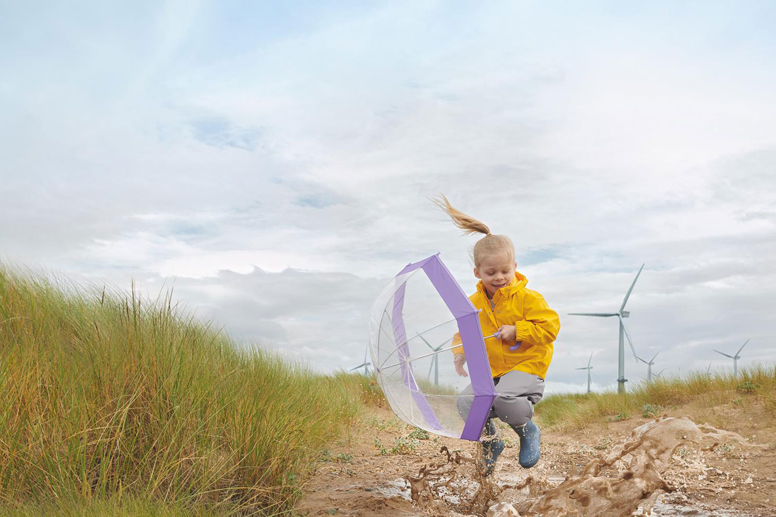
As before, the logo consists of the three capital letters ‘RWE,’ which have become softer and more compact. The corporate colours have been expanded to include green and grey and are lighter and friendlier overall. The new typo is dominated by clear, geometrical lines. RWE’s new imagery provides for a unique, clear-cut brand appearance, placing the human being, nature and technology on centre stage. Two overlapping and constantly changing energy fields have been added as new design elements. They symbolise transformation and change, while clearly demonstrating how important energy is for our society. At the core of RWE’s realignment is the commitment to produce clean and reliable electricity for this society.
Be it digital or analogue, the new design will be seen everywhere, showcasing a confident, open company – from the RWE website to apps, social media, publications and trade fairs to advertisements and office equipment.
“Our new appearance shows that RWE stands for innovation, change, transparency and sustainability. It was important to us to credibly link these statements to the strengths of our market appearance to date, which stands for stability and security,” explains Stephanie Schunck, Head of Corporate Communications & Energy Policy.
